On the crest of a wave or re-branded a failure?
When somebody on the forum suggested the other day that it was time Forest changed the club crest, the idea was widely slammed in favour of keeping the logo that is world-famous thanks to Brian Clough.
With the new Forest home shirt revealed last week, I for one was glad to see the familiar Tricky Tree – particularly when you consider how bad some recent logo redesigns have been.
For instance, across the Trent, Sven County have recently unveiled this badge:
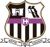
Personally I think it looks pretty smart, but a couple of the features are inexplicable, namely the castle that looks nothing like Nottingham Castle and the strange symbol at the centre (which resembles the Cross of Lorraine on its side or, more worryingly, the icon of Norsefire, the fascist dictatorship in V for Vendetta).
Still, it could be worse. A few years ago Coventry City rang in the changes with this beauty:
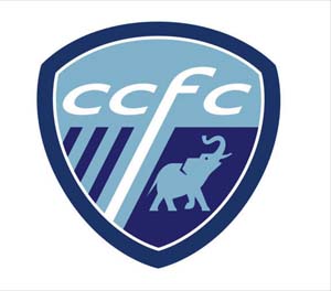
It was quickly withdrawn due to fans’ fury, but Wigan Athletic are still stuck with the drawing from a children’s book which replaced their traditional crest last year:
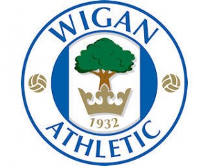
However, the worst rebranding of recent times is this epitome of ugliness that club-on-the-up Burnley will be wearing for their jaunt in the Premiership:
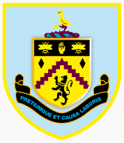
Urgh.
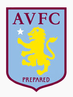
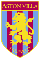
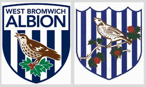
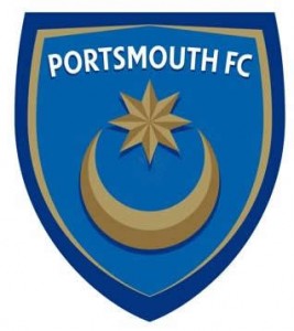
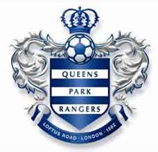
Yet it doesn’t have to be like this. Aston Villa, West Brom, Portsmouth and QPR have all managed to come up with nice new crests that take the best bits of the old ones (new design on the left):
The poster who was calling for a new Forest badge said any design should include the Major Oak and the River Trent. I’ve been playing around with a few ideas that incorporate these features and came up with this:

What do you think?

 More Features